I spent three hours last weekend staring at a wall of paint swatches, paralyzed by the sheer volume of “designer-approved” options, only to realize I was wasting time I could have spent actually living my life. Most interior design blogs want to sell you on complex color theory or expensive professional consultations, but honestly? That’s just noise. You don’t need a degree in fine arts to figure out how to choose a color scheme that doesn’t make your living room feel like a chaotic mess. Stop letting a hundred different shades of “eggshell” rob you of your weekend; it’s about finding a system that works, not chasing every fleeting trend.
I’m not here to give you a lecture on the psychology of pigment or push some overpriced aesthetic. Instead, I’m going to show you my practical, systems-based approach to picking colors that actually stick. I’ll share the exact framework I use to strip away the indecision and select a palette that feels cohesive, functional, and—most importantly—stress-free. We’re going to cut through the fluff and get your space sorted so you can get back to what matters.
Table of Contents
Mastering Interior Design Color Theory Without the Headache
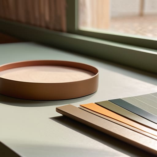
Look, you don’t need a degree in fine arts to get this right. Most people get paralyzed by the sheer volume of paint swatches at the hardware store, but you can simplify the whole process by understanding the basic mechanics of interior design color theory. Think of it like a system: once you understand how colors interact, you stop guessing and start deciding.
The easiest way to start is by deciding on a vibe using warm vs cool color palettes. If you want a space that feels like a sanctuary—something to help you decompress after a chaotic day at the office—lean into those cooler blues or soft greens. If you need an energy boost in your kitchen or workspace, go for the warmth of terracotta or soft ochre.
Don’t feel like you have to reinvent the wheel with complex patterns, either. I’m a big fan of monochromatic color schemes because they reduce visual noise. By using different shades and textures of the same base color, you create a cohesive, streamlined look that feels intentional rather than cluttered. It’s about efficiency, not excess.
Using Complementary Color Combinations to Simplify Your Space
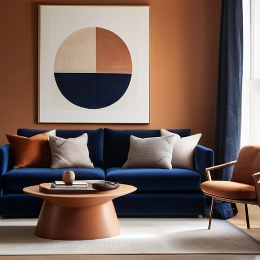
If you want to stop the mental fatigue of staring at paint swatches, lean into complementary color combinations. In the world of interior design color theory, this is the ultimate shortcut. Instead of trying to balance a dozen different shades, you pick two colors from opposite sides of the color wheel—think a deep navy paired with a soft terracotta. Because they naturally contrast, they do the heavy lifting for you. You don’t need to be an artist; you just need to let the math of the color wheel create the balance.
The trick to making this work in a real, lived-in home is to avoid the “high-contrast trap” that makes a room feel like a chaotic game show set. I usually suggest picking one dominant tone and using the complement as a strategic accent. If you’re working with a neutral base, adding a single pop of a contrasting hue can define the room’s energy without cluttering your visual field. It’s about creating a system where the colors work together so you don’t have to constantly adjust them.
5 Practical Rules to Stop the Color Decision Paralysis
- Pick a dominant base first. Don’t try to balance five colors at once. Choose one primary neutral for your large surfaces—walls, rugs, or big furniture—and let that be your anchor. It’s much easier to layer accents on top of a solid foundation than to try and balance a room of competing colors.
- Follow the 60-30-10 rule to keep things from looking chaotic. I use this in my own apartment all the time: 60% is your dominant color, 30% is your secondary, and 10% is your bold accent. It’s a simple mathematical system that prevents your eyes from getting overwhelmed.
- Test your samples in real light, not just under the store’s fluorescent bulbs. A gray that looks sophisticated in a showroom might look like a depressing concrete slab in your living room at 7 PM. Grab some cheap swatches, tape them to the wall, and watch how they change from morning to night.
- Use your existing “unmovables” as your starting point. Before you buy a single gallon of paint, look at your wooden floors, your favorite leather chair, or even a piece of art you actually love. Build the palette around what you already own so you aren’t fighting against your own furniture.
- Limit your palette to three to five colors maximum. Complexity is the enemy of calm. If you find yourself staring at a dozen different shades of blue, stop. Pick three that work together and commit. A tight, intentional palette looks professional; a scattered one just looks unfinished.
The Bottom Line: Keep It Simple
Don’t get paralyzed by endless swatches; pick a base neutral that you actually like and build your accents from there.
Use the 60-30-10 rule to stop guessing—it’s a simple mathematical framework that ensures your room feels balanced without the guesswork.
Test your colors in your own light before committing; a palette that looks great in a showroom might feel like a cave in your actual living room.
## The Core Philosophy
“A color scheme shouldn’t be a math problem you have to solve every time you walk into a room; it should be a silent system that works in the background so you can actually focus on living.”
Liam Anders Chen
Stop Planning and Start Living
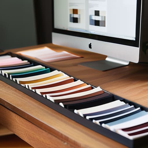
At the end of the day, choosing a color scheme shouldn’t feel like a high-stakes engineering problem. We’ve covered the fundamentals—understanding how color theory works without getting lost in the textbook, and using complementary combinations to create a sense of visual order. Whether you’re leaning into high-contrast energy or a more muted, monochromatic vibe, the goal is the same: to create a space that serves you rather than one that requires constant maintenance. Remember, a successful palette isn’t about following every design rule in the book; it’s about implementing a system that reduces visual noise and minimizes decision fatigue in your daily life.
I know how easy it is to get paralyzed by “what if” scenarios—what if the blue is too dark, or what if the beige feels boring? My advice? Just pick a direction and commit. You can always swap out a throw pillow or repaint a single accent wall later, but you can’t get back the hours you spent staring at paint swatches in a state of indecision. Stop letting the pursuit of a “perfect” room rob you of the peace that a functional home is supposed to provide. Grab your samples, make a choice, and get back to living in the space you’ve built.
Frequently Asked Questions
How do I pick a color scheme without spending my entire weekend staring at paint swatches?
Stop staring at the swatches; you’re just paralyzing yourself. Here’s my system: pick one “anchor” color you actually love—something that feels calm when you look at it—and then use the 60-30-10 rule. 60% neutral base, 30% secondary color, and 10% for your accent. It’s a simple ratio that prevents visual clutter. Grab your notebook, define those three zones, and move on. Don’t let a decision about beige steal your Saturday.
Is it possible to create a cohesive look if I already have furniture in colors that don't match?
Absolutely. Don’t tear out your sofa just because it doesn’t “match” the new rug. I’ve dealt with this plenty of times when rearranging my own space. The trick isn’t matching colors; it’s creating a thread that ties them together. Use a neutral bridge—think a grey throw or a cream rug—to soften the transition, or repeat one minor color from a piece of furniture in your decor. It’s about cohesion, not perfection.
How many different colors can I actually use before a room starts feeling cluttered and overwhelming?
Look, I’m a systems guy, and I view color like any other component in a workflow: too many variables create noise. For most rooms, I stick to the 60-30-10 rule. 60% a dominant neutral, 30% a secondary color, and 10% an accent. If you start pushing into five or six distinct hues, you aren’t designing; you’re just managing chaos. Keep your palette tight so your brain can actually relax when you walk in.